I hope you are doing good. We had warm weather this weekend and it was great. A little wind with it but it was very nice. I have a few photos to share with you.
It was a gift of a day with blue skies on Saturday.
I managed to 'play' a little on the back porch.
We went out to a field to catch the sunset and I started taking photos of the tall grass with the sun turning it into gold.
With a whisper of sun left, you can see the bare January trees outline.
I know February is here and lots of ladies will be getting flowers this Valentine's Day. There are some that won't receive them from a special someone for different reasons, I say go get them for yourself! Don't let yourself feel down, go and get them early so you can enjoy them before they get picked over. After all, you know what kind of flowers you want the most. :)
I came across an egret at the lake today. Egret ~ A heron with mainly white plumage, having long plumes in the breeding season. I usually can't get close enough to one to get a good shot but I think this one was really hungry and was only focused on feeding.
They usually fly off before you could think about getting close.
Have a happy week!
Jan
Sunday, January 31, 2016
Saturday, January 30, 2016
Fabrics First!
Hi! I am glad you came by today. There's a beautiful home waiting for you to admire. This home belongs to owners, architect Alex Kaali-Nagy and interior designer Karen Kaali-Nagy. Alex hails from Europe and it's influence is apparent. He believes that rooms should not be intimidating and all rooms should have the same decorating feel.
In New England Home, "Karen feels the home's sense of peacefulness comes from the symmetry used throughout the home." “I always work backward,” she laughs, “fabrics first, then wall color, furnishings and carpet." I decorate exactly the same way! We think alike!
The circular entry hall with it's spiral staircase.
The entrance hall with hand-painted wallpaper.
The dining room.
My heart stopped when I saw this room. The large portrait with the floral drapes and the red sofa took me over the edge! You can see the fabric that is used in the dining room on the chairs has the same hue of red in the living room making the spaces flow to one another.
Then I was surprised when I came across this view of the room. The red sofa is the only red used in the room. I am surprised it wasn't continued in the room in some way, a few pillows with red would certainly help make it appear more balanced. It almost looks like two separate rooms.
Later, I came across this photo with the furniture now placed in a definitely different room.
This is such a handsome room that is also cozy.
Karen does the cooking in the family. She has two dishwasher and two refrigerators. “We used Calacatta marble for the countertops, but topped the island with butternut. It’s a good balance,” Karen explains. "A butler’s pantry in Brunschwig et Fils paper links kitchen and dining room for ease of entertaining."
They have two sons and this is one of their bedrooms.
The master bedroom is described as “Enveloping,” by Karen.
For more information go here. to European Union/New England Home. You can see more of this home at the owner's site, The Kaali-Nagy Company here.
Jan
Sunday, January 24, 2016
Kitchens To Adore
I am so glad you stopped by today. There are different styles of kitchens I would like to share with you. I know white kitchens are all the rage now but it's fun to see different styles to appreciate all that there is. I like both painted kitchens and warm wood tones. What's your preference?
Green tiles against those copper pots, bliss!
Habibi Interiors here.
Elle Décor
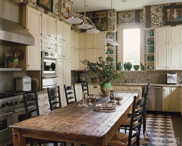
Painted cabinets with that wonderful worn table. A table in the kitchen is so much friendlier than an island. Do you see your family gathered around this table? Or having a friend over for coffee while you are baking something in the oven and the kitchen fills with the smell of fresh baked muffins. I love the warmth of this kitchen, it really differs from the whole island thing. Did we go wrong? Should we have tables in our kitchens instead?
Segreto Finishes/ Joyce Horn Antiques
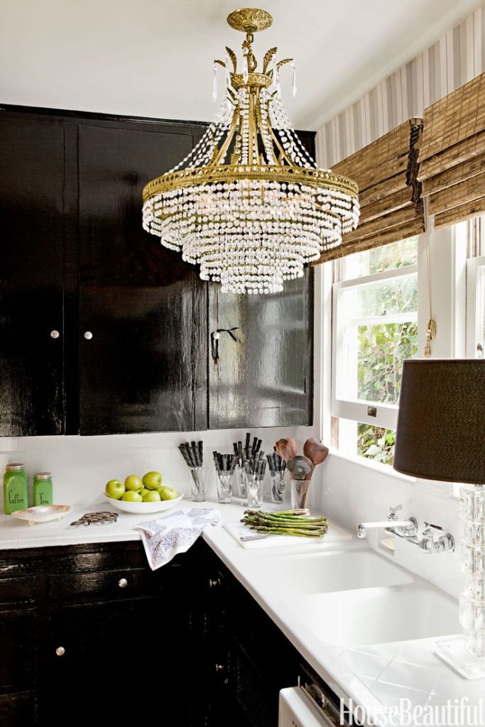
Very dramatic kitchen, look at that finish on the cabinets. Notice the chandy!
House Beautiful
House Beautiful
Nothing but wonderful features in this kitchen. Wooden beams, light fixture, medium tone wood cabinets, French doors and that table!
Found on traditionalhome.com
Pretty almost ladylike kitchen! I like the base of the island being darker as it grounds the room so well.
mydesignchic.com
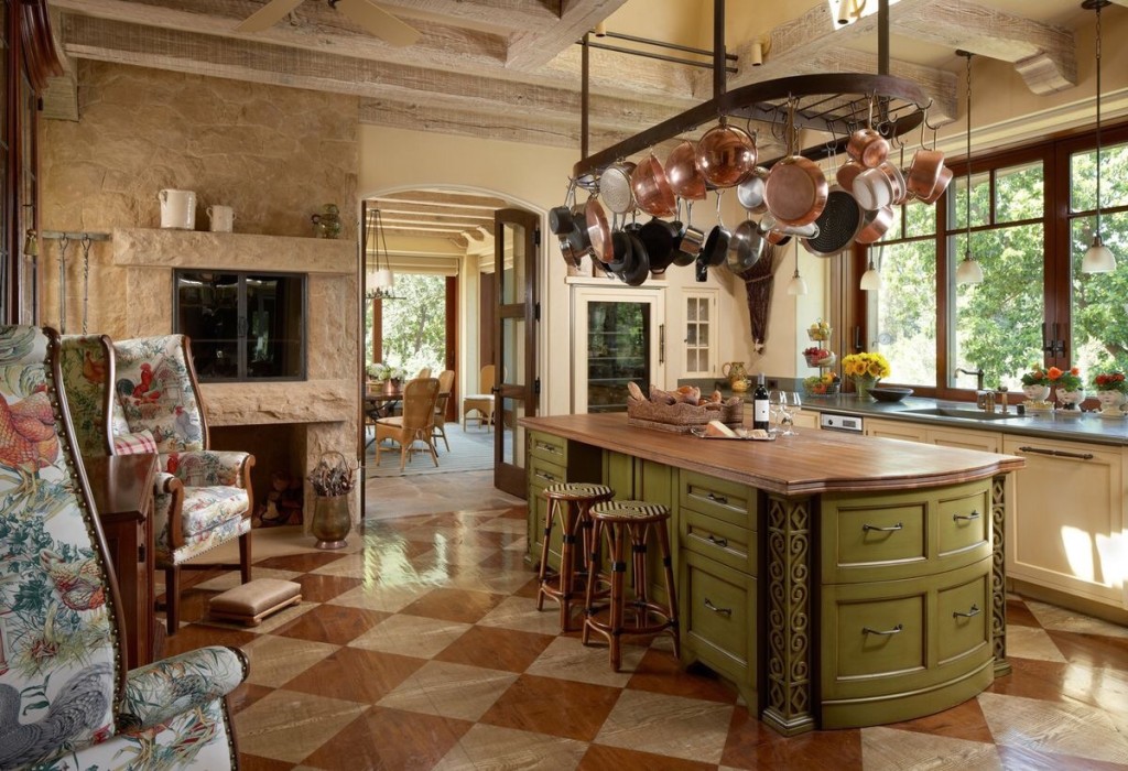
I am in love with this floor and how about this kitchen! I know you see all the windows with a great view of outdoors and the island wearing that green paint. That's a truly working island with all the drawers. Looks like a wonderful fireplace that you can cook in. It's all so very welcoming. The chairs are just perfect for this room.
edwardlobrano.com/dancing-hares here.
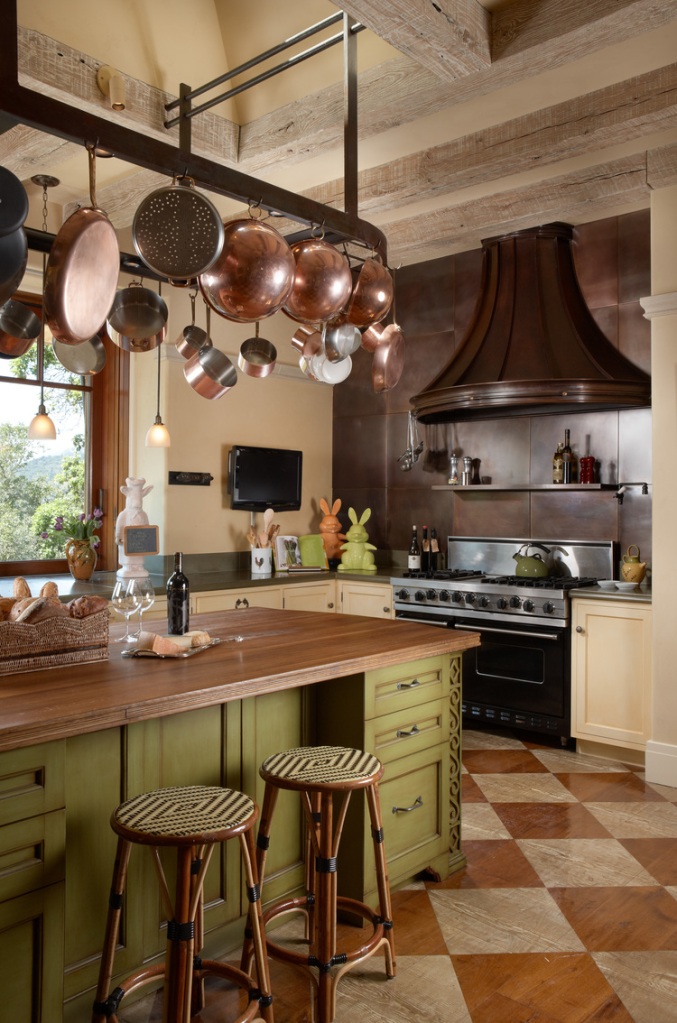
And a side view of the kitchen.
Victorian Kitchen at Christmas
From Country Living
Wonderful old world feeling to this kitchen. I love wood tables in a kitchen.
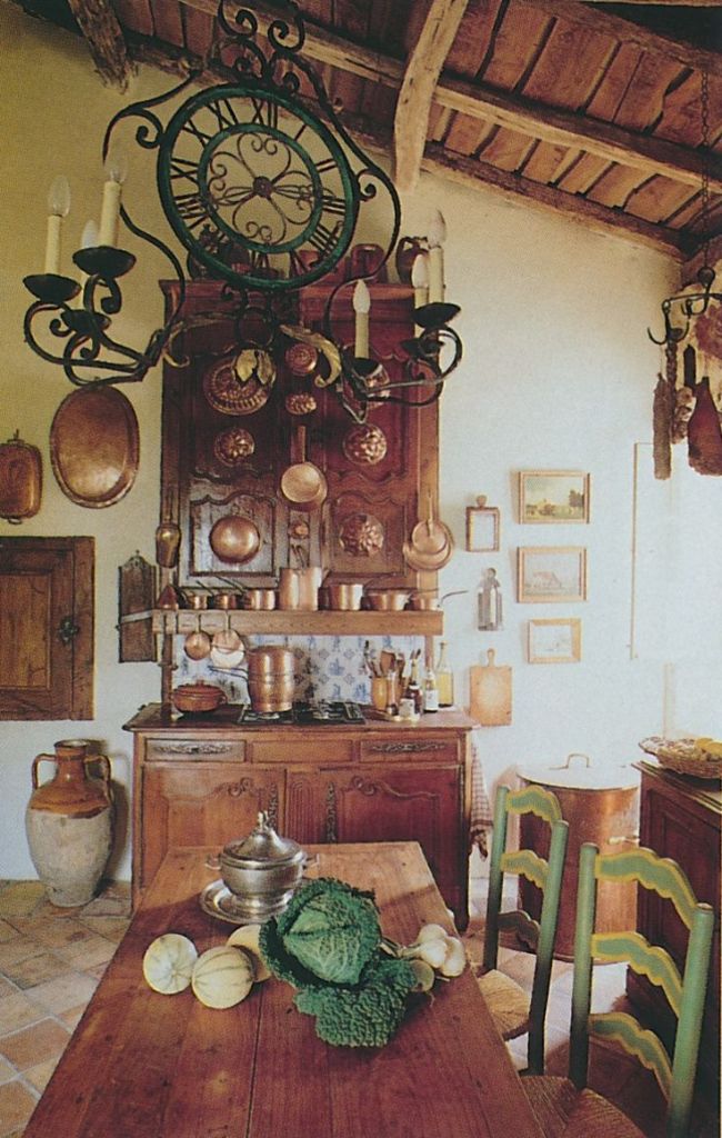
Richard Lowell Neas - Jacques Dirand Photographer
The former Joan Rivers' Kitchen ~ There is so much going on above the standard kitchen. The ceiling is so dramatically high and the portraits are unique to a kitchen.
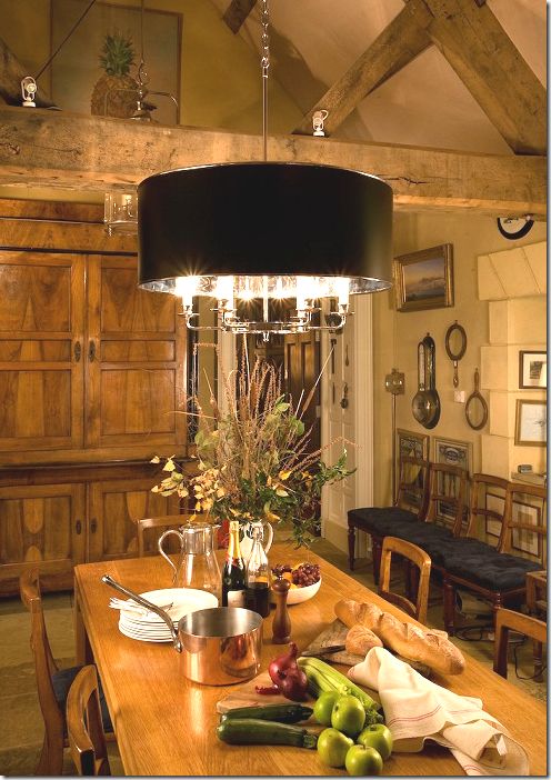
Custom Charles Edwards fixture. Hanging is the Large Clover Lantern with the Drum shade in tole and nickel here.
This is such a pretty kitchen with the painted white cabinets and soft color of blue. I just wonder if I could cook in a pretty white kitchen, I think I would always be worried about making a mess!
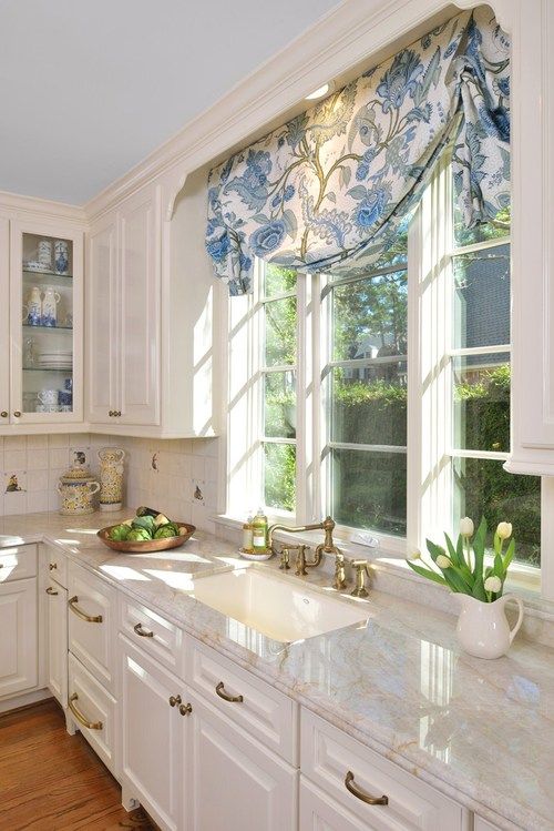
carlaaston.com
Love the whole feeling in this kitchen! Warm wood cabinets with painted wood floors that have been walked on and not afraid to show it! Look at that oven! You can definitely cook in here.
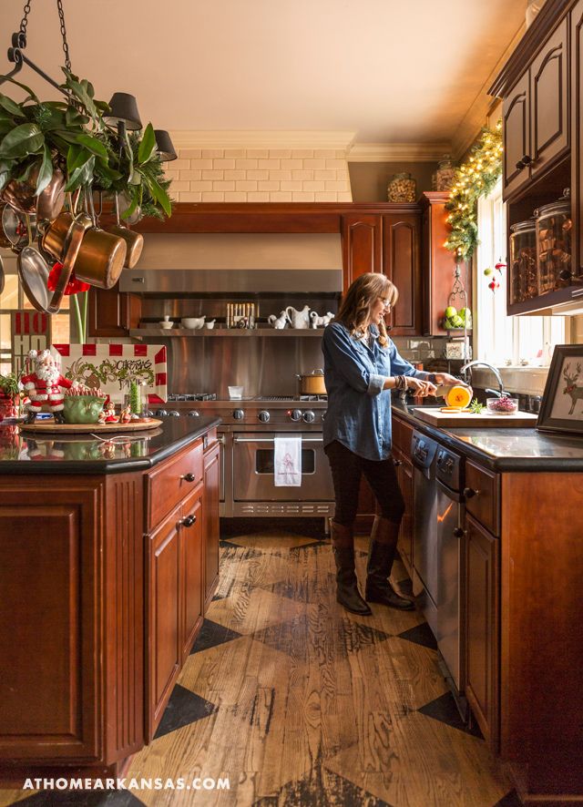
athomearkansas.com
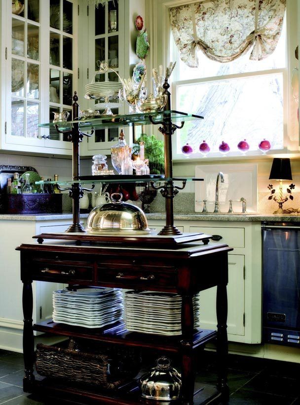
Cozy little kitchens have a way of drawing you in. Look at the beautiful antique furniture being used in the kitchen. Super organization here with a definite vintage look.
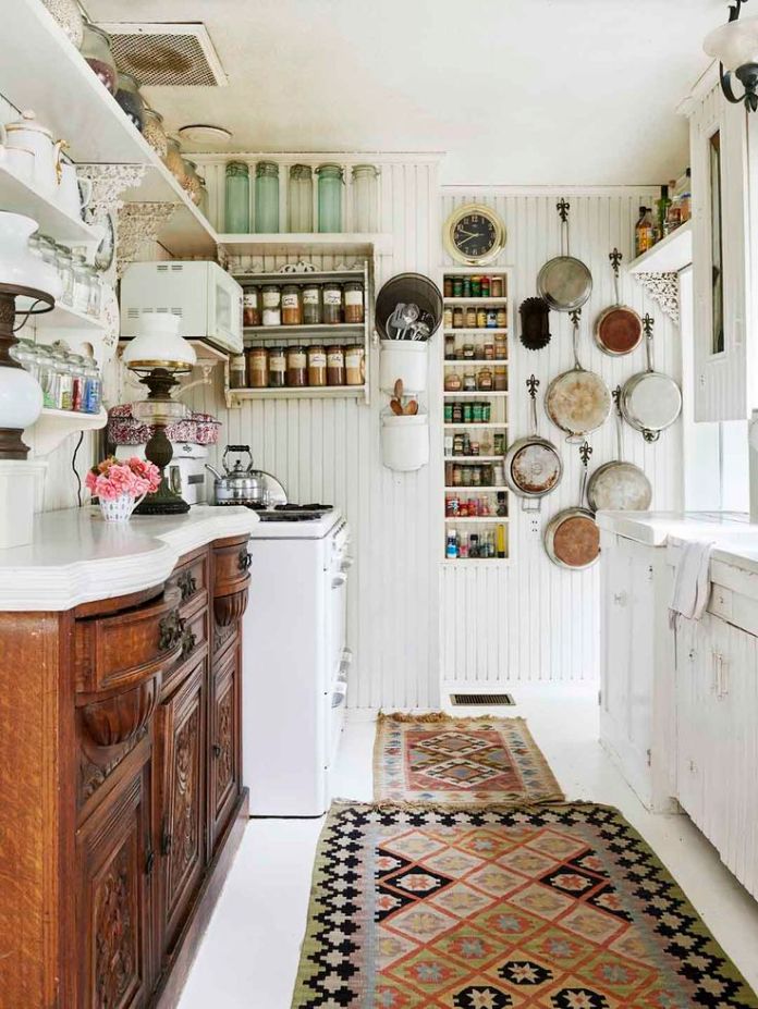
thestylesaloniste.com
The same kitchen from the opposite side.
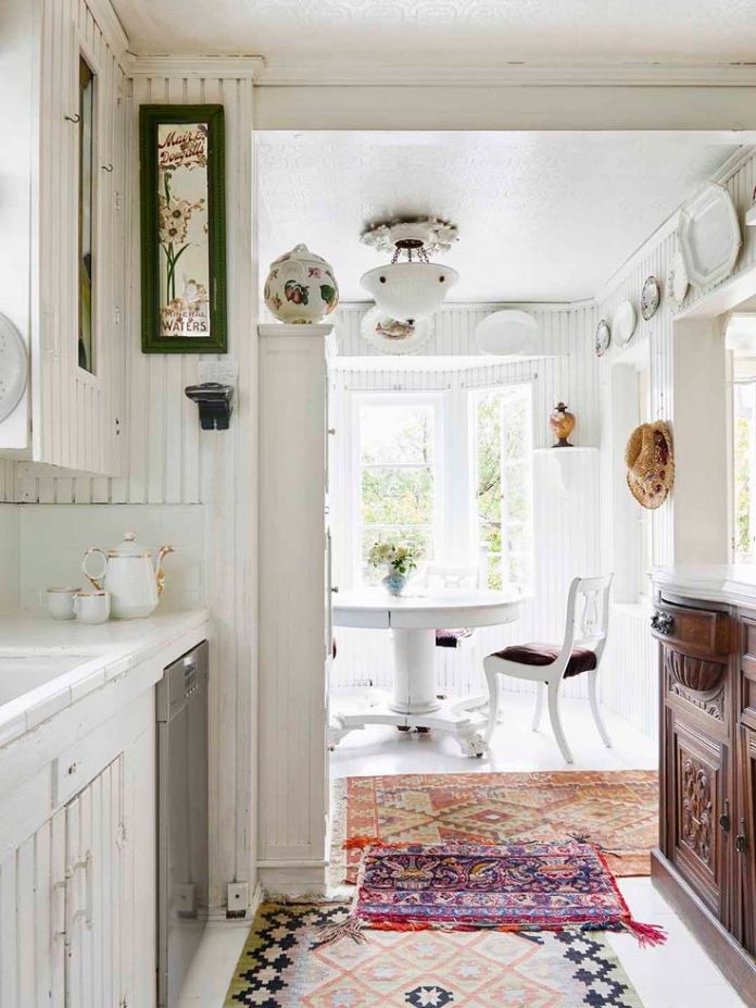
thestylesaloniste.com
ozarchitects.com
Found on bystephanielynn.com
The Seattle Times here.
And ending with a grocery store in Russia. Isn't it beautiful!
Jan
Monday, January 18, 2016
Styling Your Sofa
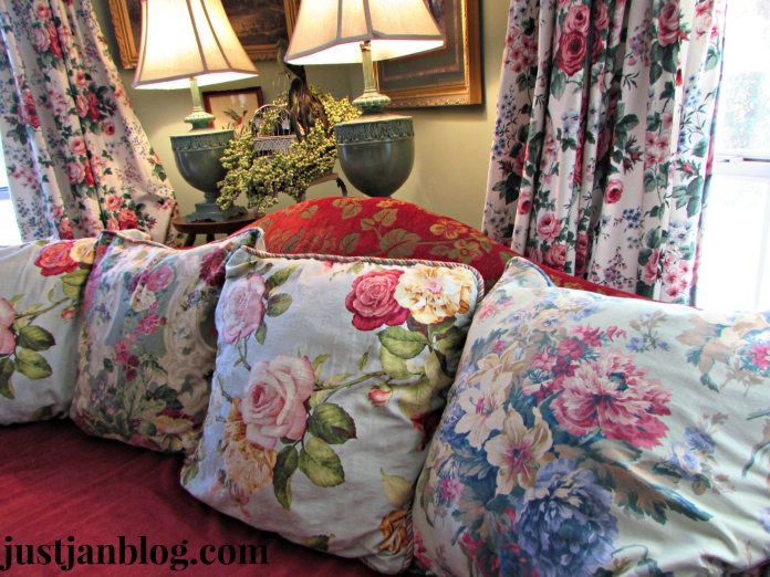
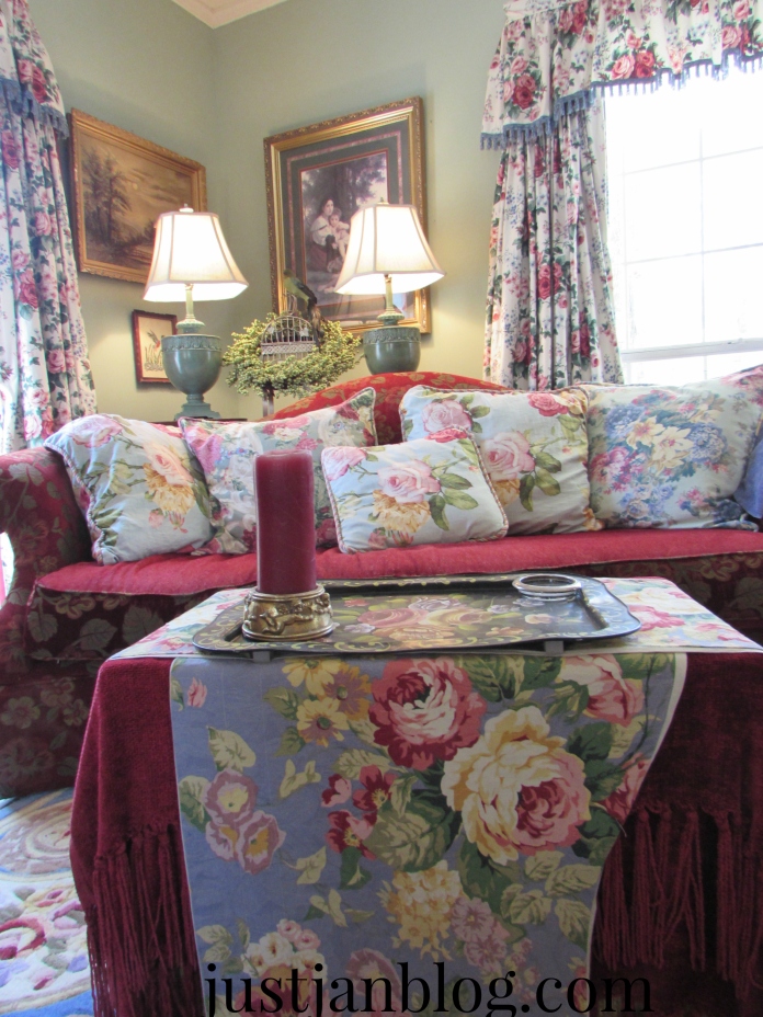
Thanks for stopping by today. Pillows are the topic of the day. First, what is your favorite style of pillow? Are you a floral lover? What about some of the new styles? Do you love them or loathe them? Do you have a new look you are enjoying? It's so easy to style the look of your sofa anytime you like by changing not only the pillows but the spaces behind and in front of your sofa.
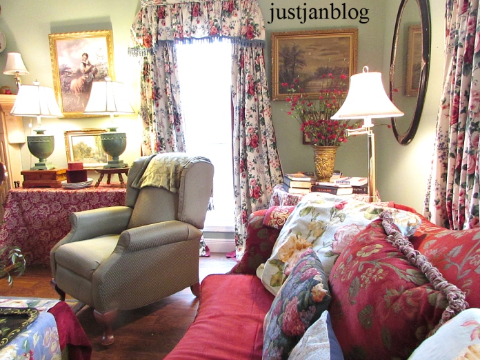
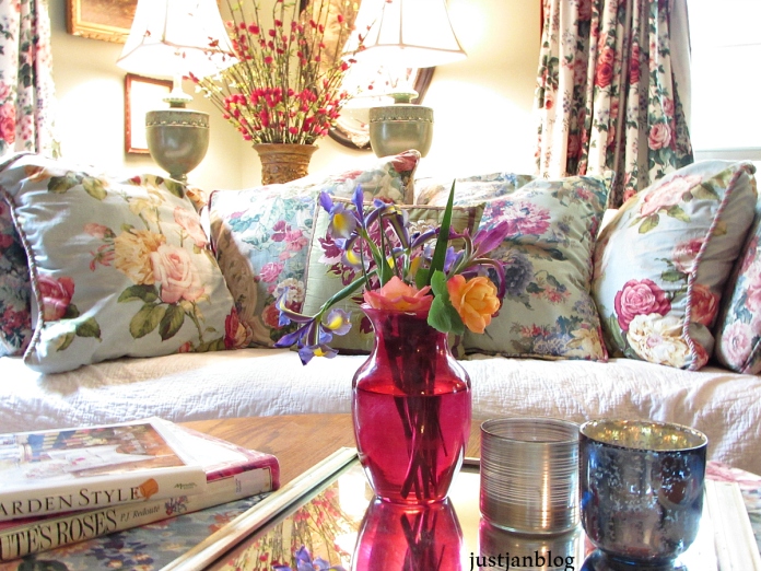
This is all about cozy! A favorite winter look for me is to have the sofa in front of the double windows. It may not be warmer but it looks and feels so cozy to me. The sofa wears its' usual red with oh so many pillows!
The green in the pillows are brought out there with the tulips and green apples.
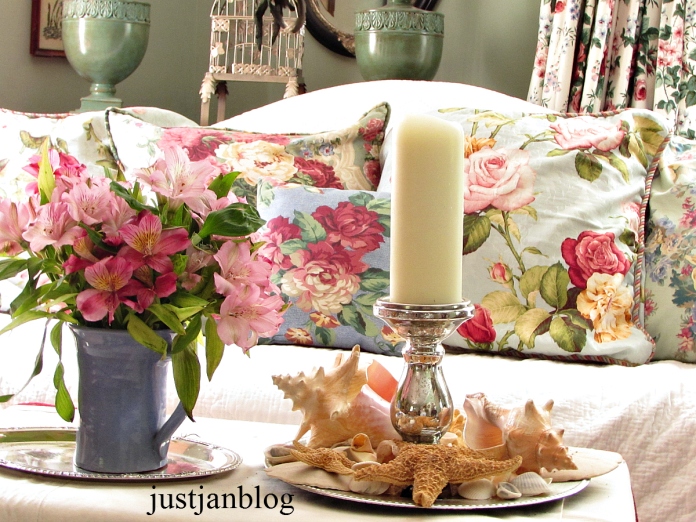
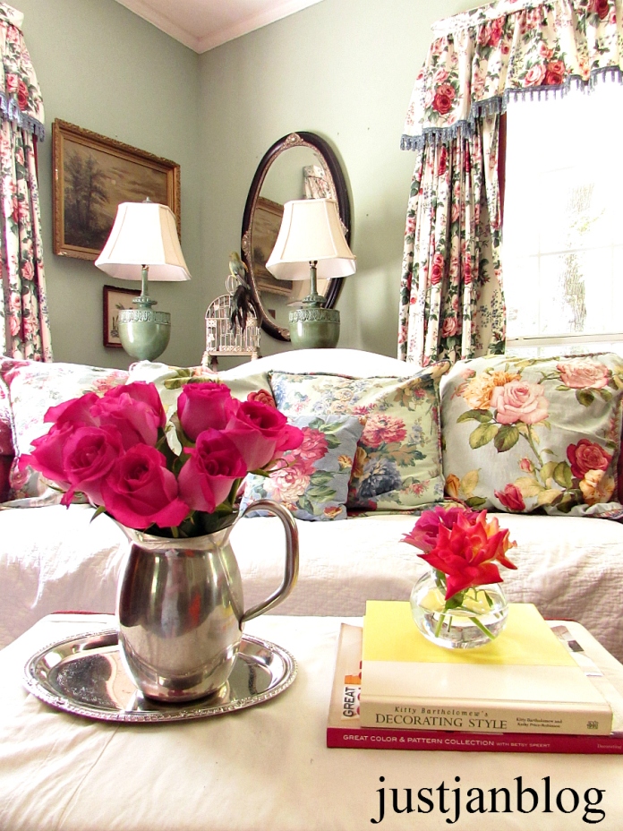
Smaller pillows can enhance a look. White tea towel and blue and white runner draped across smaller blue pillows give an extra oomph to the look. The blue is repeated on the coffee table with blue candleholder on a blue and white plate and blue pitcher with roses.
Just using a few extra items bring the room into the Fall season. The Fall floral with yellow roses are sitting with the velvet pumpkins on the coffee table give solid clues to the season. The solid green pillow and green throw are reinforced with the Autumn leaves behind the sofa so there's no doubt it's Fall.
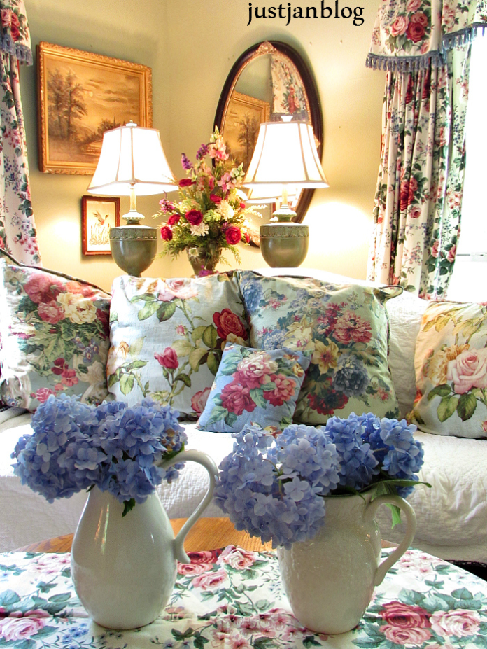
There's no doubt it's a summer here. The sofa covered in white says "It's summer!" The blue hydrangeas in white pitchers sitting atop the floral runner that match the curtains insure it's a cool look for summer.
There are guidelines as to what looks best together. I usually ignore rules.:) They have rules for contemporary looks and traditional ones. It makes my head dizzy to try to remember them! Buy what you love, that's the only rule! Seriously, you know as you grow older you are drawn to the same colors and look. Sometimes it takes a while and you may try different looks until it feels like you. When you find your look it's all good, the fun begins. The colors and patterns will usually all play well together. So enjoy!
I like the pillow cover a little larger than the sofa pillows as it is easier to maintain it. I can fluff the pillow while it's in the pillow cover although I admit I can be guilty of having empty corners that give the pillows an "ear" look to them. There isn't any down in the sofa pillows that I am aware of but they have a whole lot of give and are super squishy.
Fresh flowers from the yard compliment the Spring look.
A definite Fall look here with the throw and leaves behind the sofa. The smaller pillows added the fall feeling.
Jan
Subscribe to:
Posts (Atom)